Reset CSS File
Source: Josh W ComeauResets browser css rules to sensible defaults. Instead of removing all default browser styles.
Code
/*
Josh's Custom CSS Reset
https://www.joshwcomeau.com/css/custom-css-reset/
*/
*,*::before,*::after {
    box-sizing: border-box;
}

* {
    margin: 0;
    padding: 0;
}

body {
    line-height: 1.5;
    -webkit-font-smoothing: antialiased;
}

img, picture, video, canvas, svg {
    display: block;
    max-width: 100%;
}

input,button, textarea, select {
    font: inherit;
}

p, h1, h2, h3, h4, h5, h6 {
    overflow-wrap: break-word;
}

#root, #__next {
    isolation: isolate;
}
Reasons
-
1. Use a more-intuitive box-sizing model
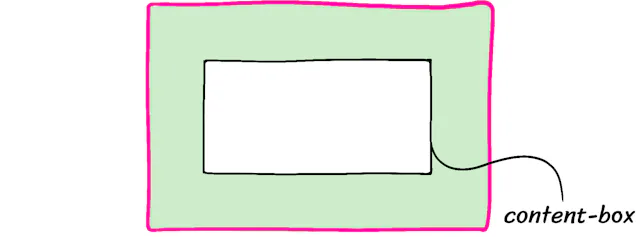
*,*::before,*::after {
    box-sizing: border-box;
}
By default the browser calculates a width of an element by only looking at the content-box portion (white-box). "box-sizing:border-box", calculates the width of an element by adding up the border (pink-area), padding (green-area) and content-box (white-box).
-
2. Remove default margins
* {
    margin: 0;
    padding: 0; //Maybe
}
Margins are tricky to deal with. Better to just remove them all and adjust case by case basis. Generally prefer adjusting padding.
-
3. Tweaking line-height
body {
    line-height: 1.5;
}
Default value for line-hight is around 1.2. A line-height of 1.5 means each line is 50% larger than the elements font size. WCAG criteria states that line-height should be at least 1.5. This is generally meant for bodies of text and not headings.
-
4. Font Smoothing
body {
    -webkit-font-smoothing: antialiased;
}
This turns of "subpixel antialiasing", this only effects MacOS computers. This was originally intended to to improve text contrast. With display resolutions very high this does not seem to be an issue anymore. But for some reason for browser defaults it is still enabled. Despite being disabled in the os.
-
5. Sensible media defaults
img, picture, video, canvas, svg {
    display: block;
    max-width: 100%;
}
By default images and other media are "inline" elements. They are supposed to be placed in the middle of paragraphs, like <em>. However, in modern websites they are never used that way and are used as layout elements. Setting "display: block" starts the element on a new line taking up the whole width.
Setting "max-width: 100%", is to keep large images from overflowing. It will never be bigger then the container it is in.
-
6. Inherit fonts for form controls
input, button, textarea, select {
    font: inherit;
    font-size: 1rem;
}
By default buttons and other form inputs have there own text styles. For example, a "<textarea>" will use the system-default monospace font. Text inputs also use the same system-default sans-serif font. Setting "font: inherit" takes the parent elements font styles. Including font-size, font-weight and font-family.
Also by default the font sizes for form inputs will be small about 13.333px. On a mobile device this is especially a bad experience as the mobile browser will automatically zoom in to the form input for anything below 16px or 1rem. Setting the "font-size: 1rem" is a must.
-
7. Word wrapping
p, h1, h2, h3, h4, h5, h6{
    overflow-wrap: break-word;
}
By default words will only "soft-wrap" if there is a hyphen or whitespace. If not the text will overflow from its container. Setting, "overflow-wrap :break-word" is a hard-wrap breaking the characters in between words.
-
8. Root Stacking context
#root, #__next{
    isolation: isolate;
}
Used for JS frame works like React. Create a new stacking context with needing to set a z-index. Ensures modals and dropdowns are always on top.